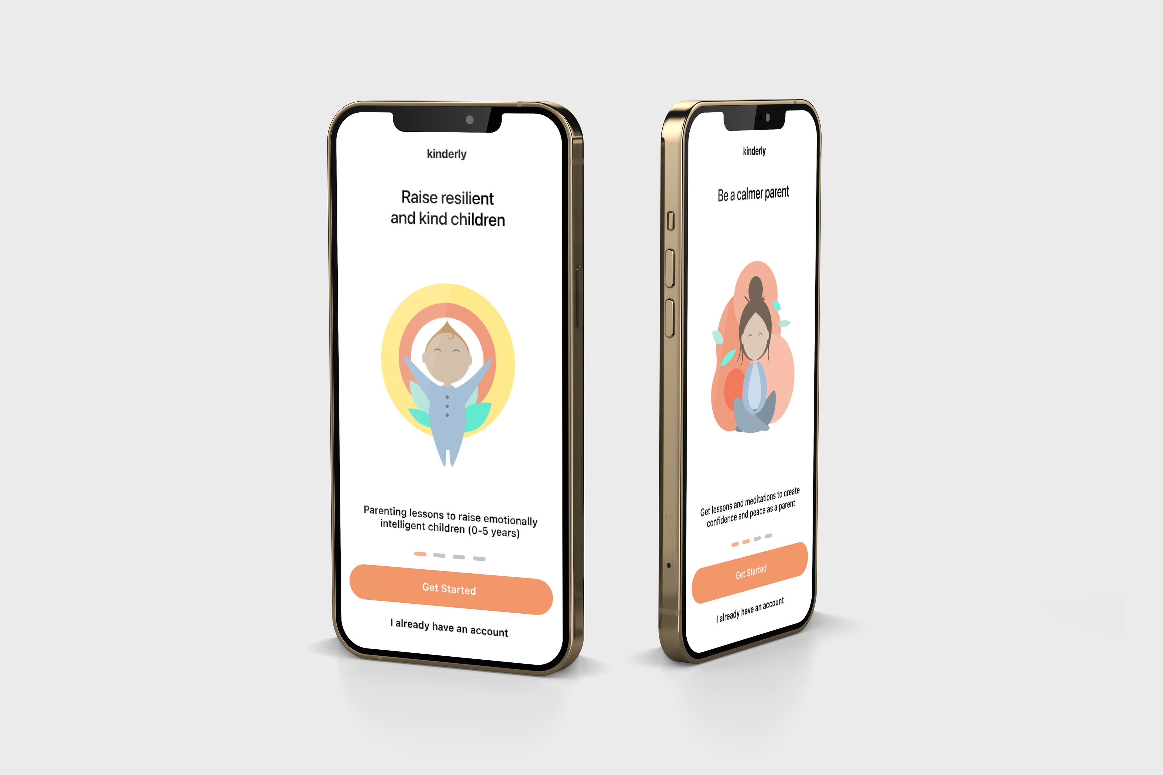
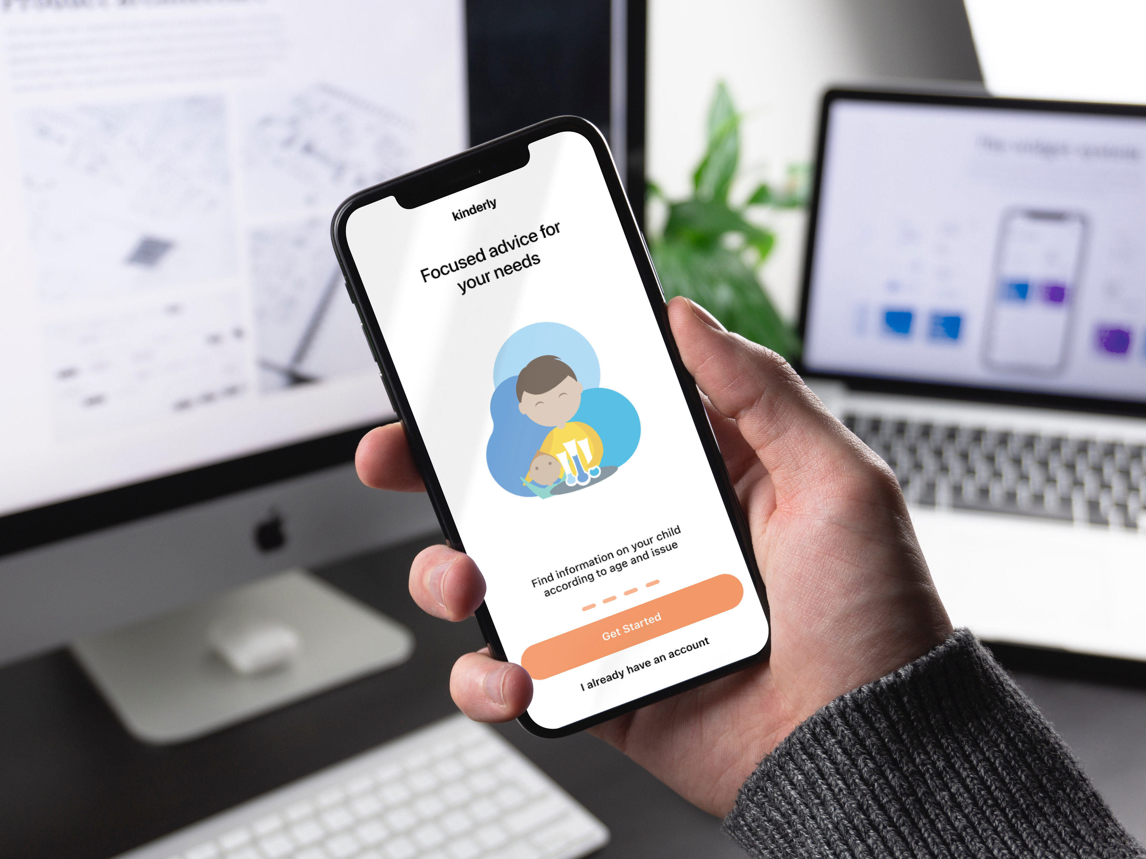
The mockups shown above are an example of what the illustrations will look like within the launched app. Since Kinder incorporates a large amount of white space, my client and I chose to make the characters brighter to give a more dynamic and playful appearance to the onboarding process.

"Happy Child"

"Devoted Dad"
The colour palette was pre-selected by my client, however the intensity of the shades was a decision we reached together. Each character communicates a different type of parent. I wanted to showcase variety while keeping within colour constraints and character theme. The result was a set of 4 characters that work just as well together as they do apart.
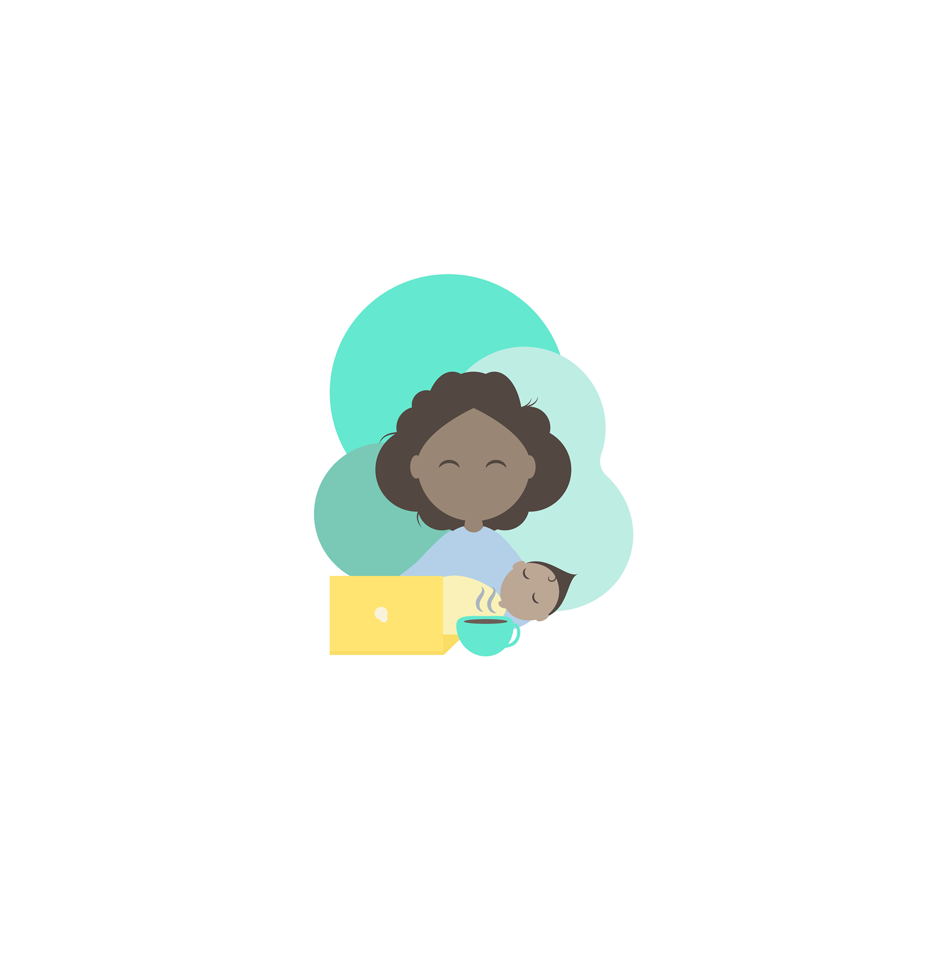
"Busy Mom"

"Meditating Mom"

Alongside the character illustrations, I produced a set of five emotes to be used as a rating system for users of the Kinder app. I chose two main colours from the colour palette, blue and green. The green communicating joy, and the blue showing discontent. the two colours, when used together, create a type of gradient that is both visually appealing while also clearly represents each emotion.
Software Used:
Adobe Illustrator