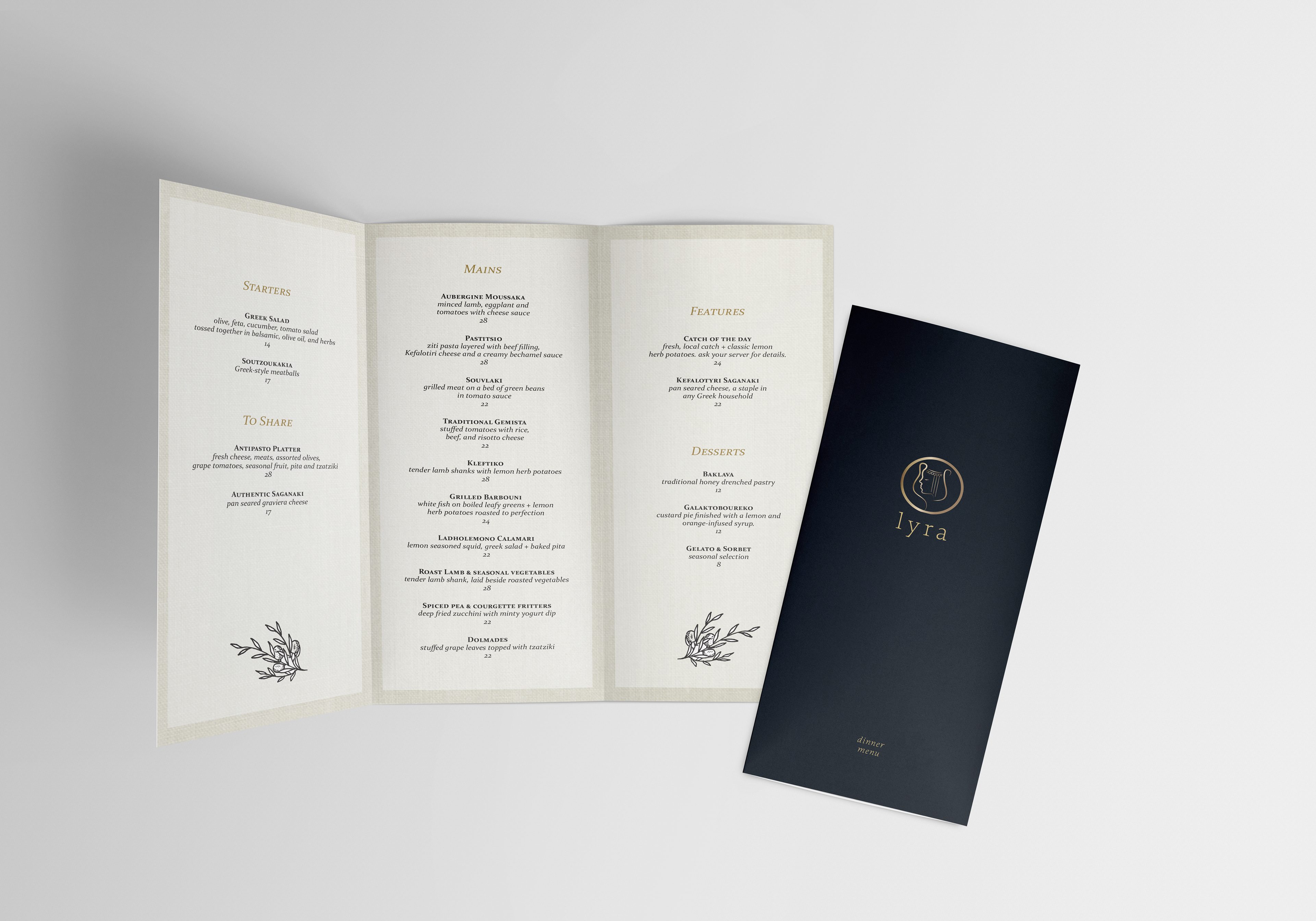
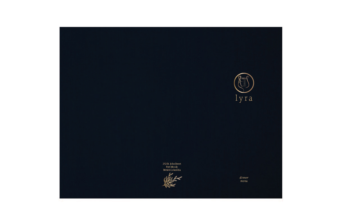
When imagining the menu design, I took into consideration lighting constraints and ease in perusing the menu items as environment conditions effect how a design is received. Since my vision of Lyra was that it was a low lit, classy restaurant, I wanted to embrace the mood and chose to use a dark navy as my colour choice for the menu cover. The inner layout is brighter, a linen hue, so as to still be easily read in a dark environment while also not being too harsh on the eyes.
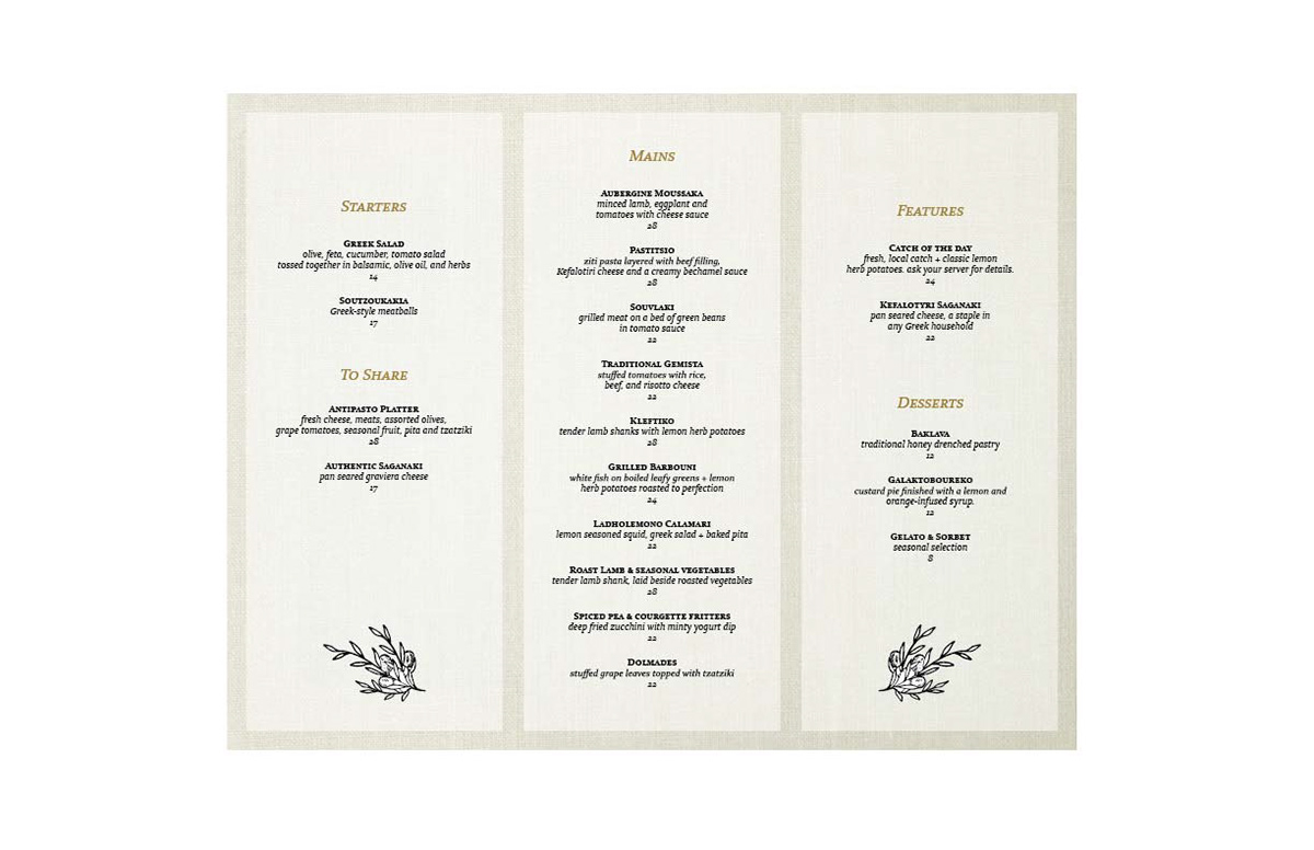
I used my own illustrations for both the final logo and artwork. To reflect and capture the Greek culture, I incorporated both ancient and modern Greek traditions through the use of gold (symbolizing prosperity and good fortune) in my logo and accent typography as well as drawing on the warmth and hospitality for which Greece is known through the simple illustrations of an olive branch and a bottle of good wine. In addition, the linen style backdrop to my menu calls to mind freshly hung laundry and laughing faces.
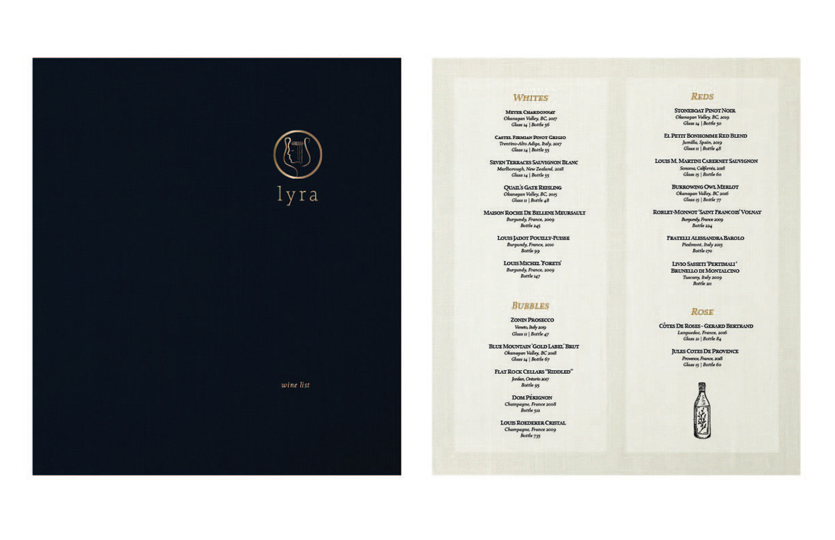
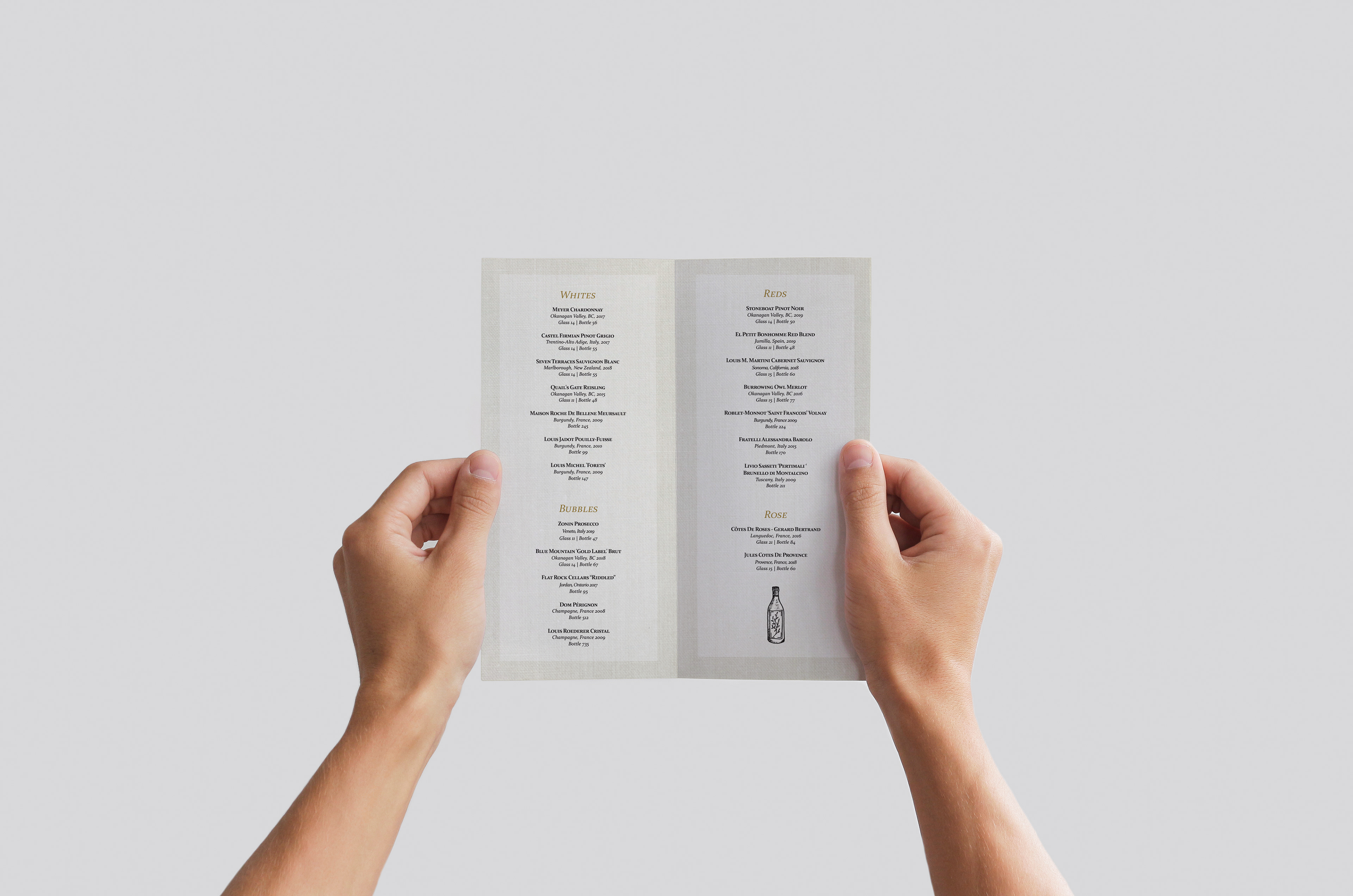
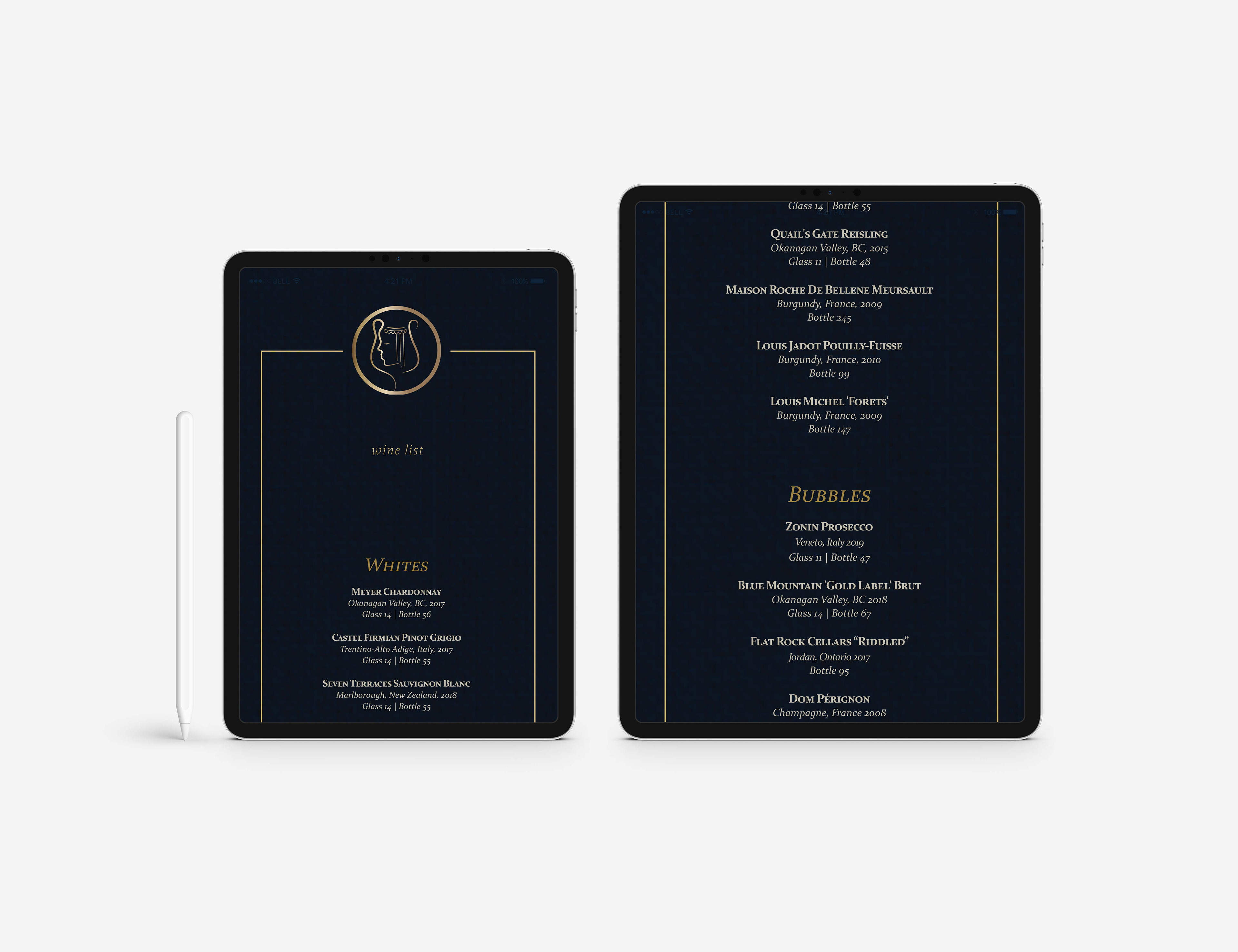
For my wine list, I chose to create a bi-fold style brochure and have the wine listings span two columns.
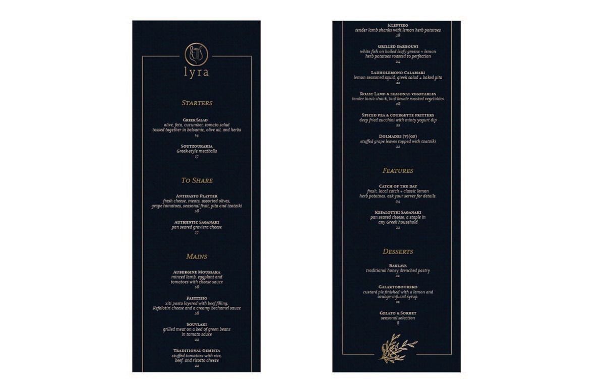

For the digital version of Lyra's menu, I took into consideration that it would be viewed on an tablet, a device that has its own backlighting. Because of this, I inverted my physical menu layout design and traded dark typography for lighter; the navy blue hue from the menu cover for the backdrop to the digital menu listings. The dark backdrop and lighter text will enhance guests experience when adjusting to a dark environment where a harsh blue light would be an uncomfortable contrast without the dark theme to cancel out that adjustment.
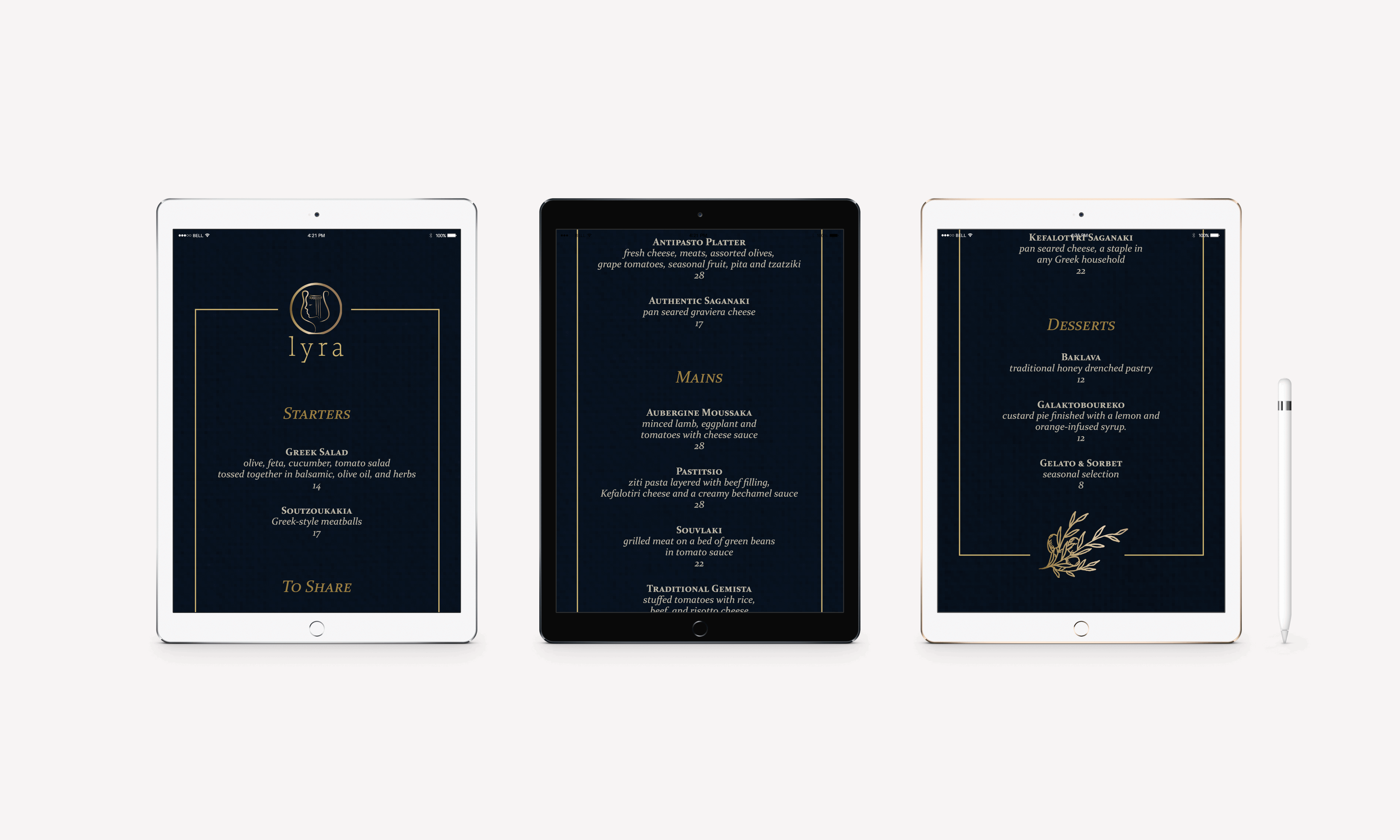
Continuous scroll for navigational ease.
Software Used:
Adobe Illustrator | Adobe InDesign | Adobe Photoshop