This portfolio piece outlines the core design components of my re-brand for Chill Foundation. The final step in the entire process was to create an ad campaign and multiple ad variations for a variety of ad formats. I have also included product branding as a part of my research.
Chill Foundation is a unique non-profit organization that focuses on helping at risk youth discover their own individual strengths and potential. The programs offered by Chill have proven time and time again to be both effective and crucial in kick starting the success of many young people in Vancouver and various other cities throughout North America. My intention with rebranding this organization was to extend its reach, particularly in the Greater Vancouver area, where young people could benefit greatly from such an innovative set of programs.

Chill Foundation's Current Logo (2020)
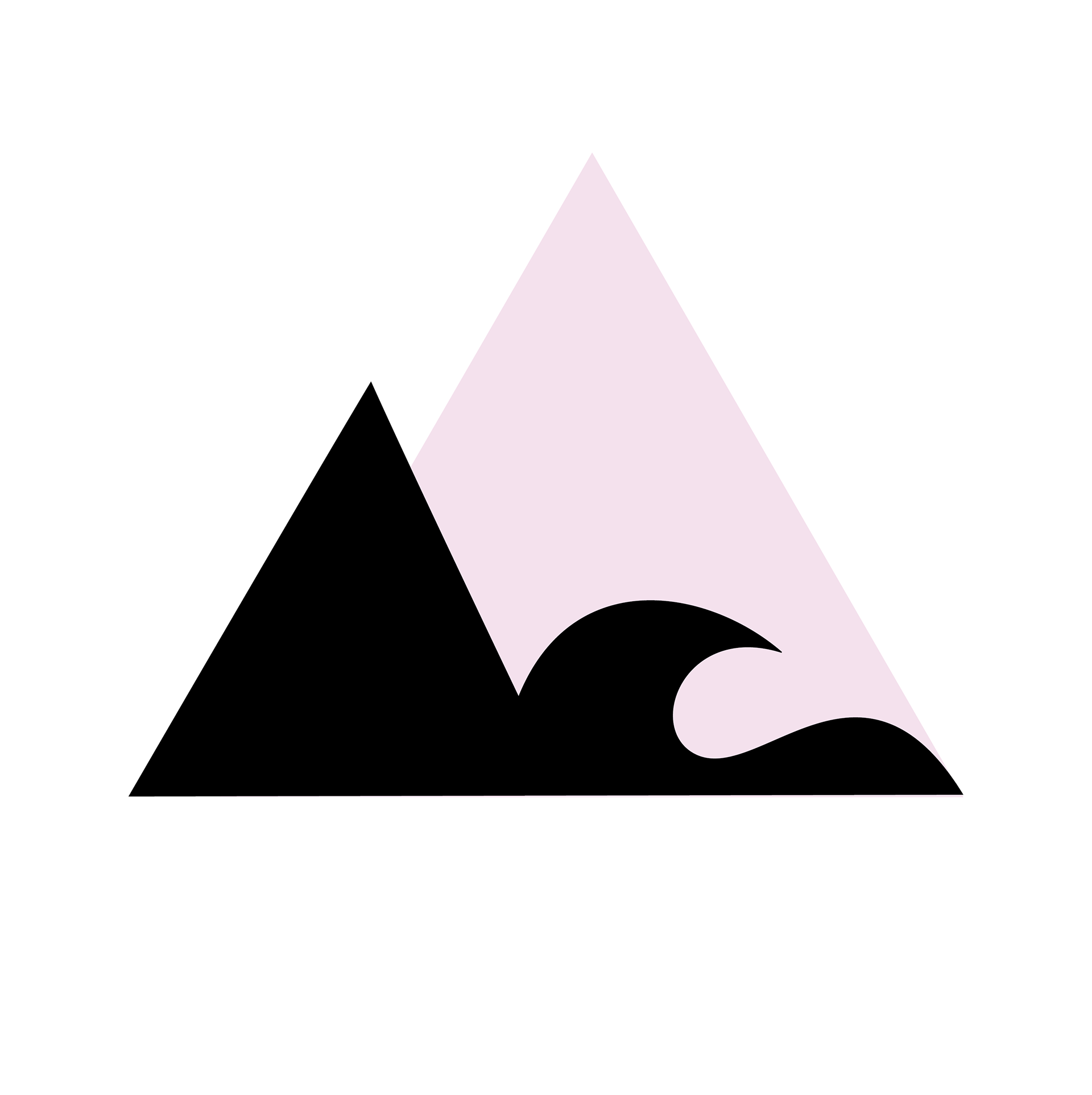
My proposed Re-design
My first portion of the rebrand process (following the initial research) was logo development.
Chill Foundation's current logo is vibrant, sporting a hot pink geometric pattern. Their most frequently used version, however, is the black and white logo. This choice makes sense in the context of their website, as it has a dark-mode layout. Unfortunately when the signature pink is removed, their logo loses it’s vibrancy and unique appearance. Without colour, it becomes less eye-catching and unique. When re-designing the logo, my hope was to weave a story that would make it more in line with the cause. Not only would it stand out, but it would also convey a clear message that speaks clearly to who Chill are as an organization.
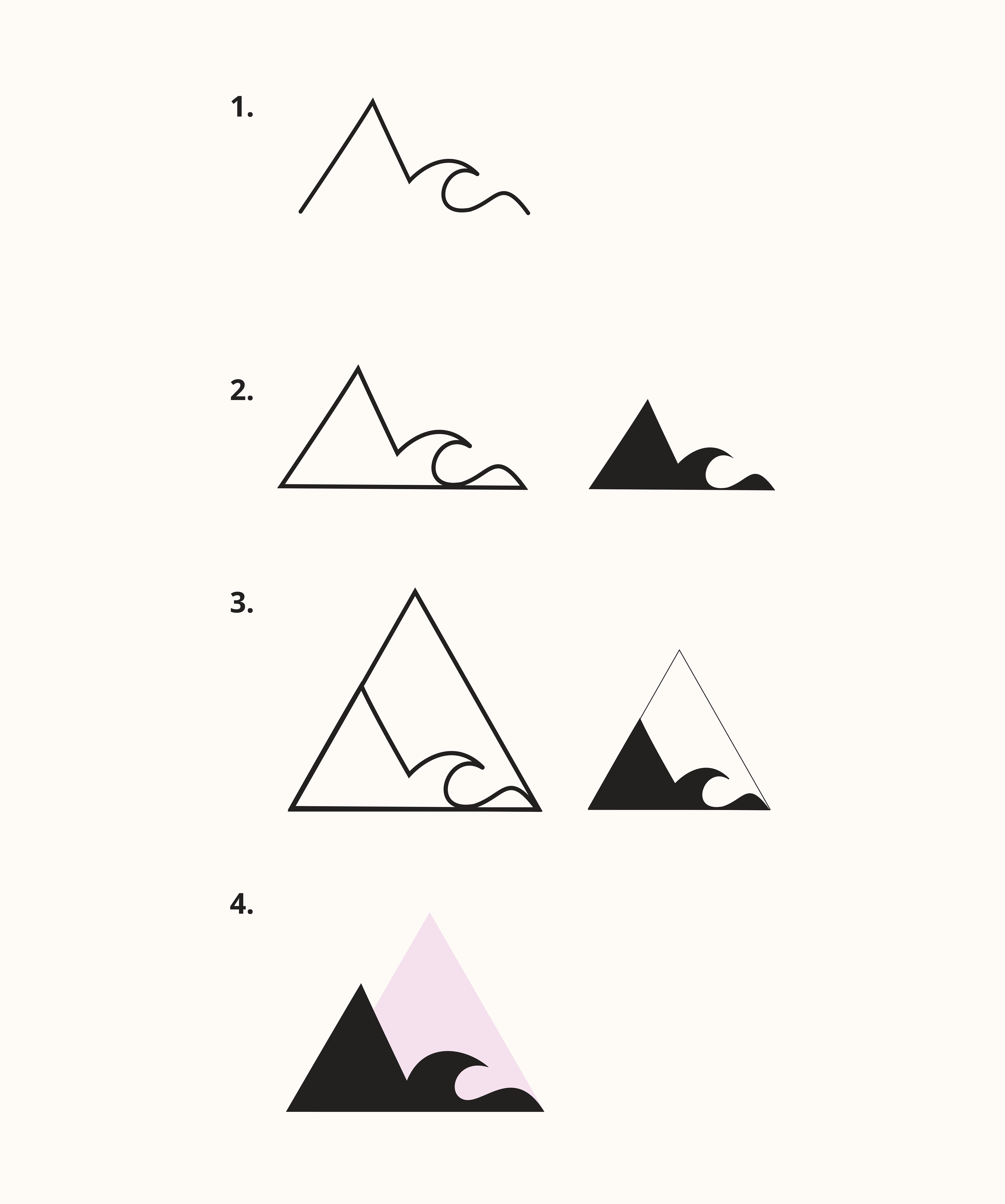
The Logo Development Process
Elements: The 3 Sports of Chill Foundation
1. Snowboarding = Mountain Peak
2. Paddle boarding = Wave / Ocean
3. Skateboarding = Hill / Mound
THE FINAL OUTCOME | THE EAGLE
Combined, these 3 visual elements form the outline of an eagle taking flight. The eagle felt extremely fitting with Chill's cause in mind. Many of the young people they cater too are starting with little to no exposure to the above mentioned sports.
Chill strives to transform these young lives, to launch them into a life that is meaningful and brimming with purpose.
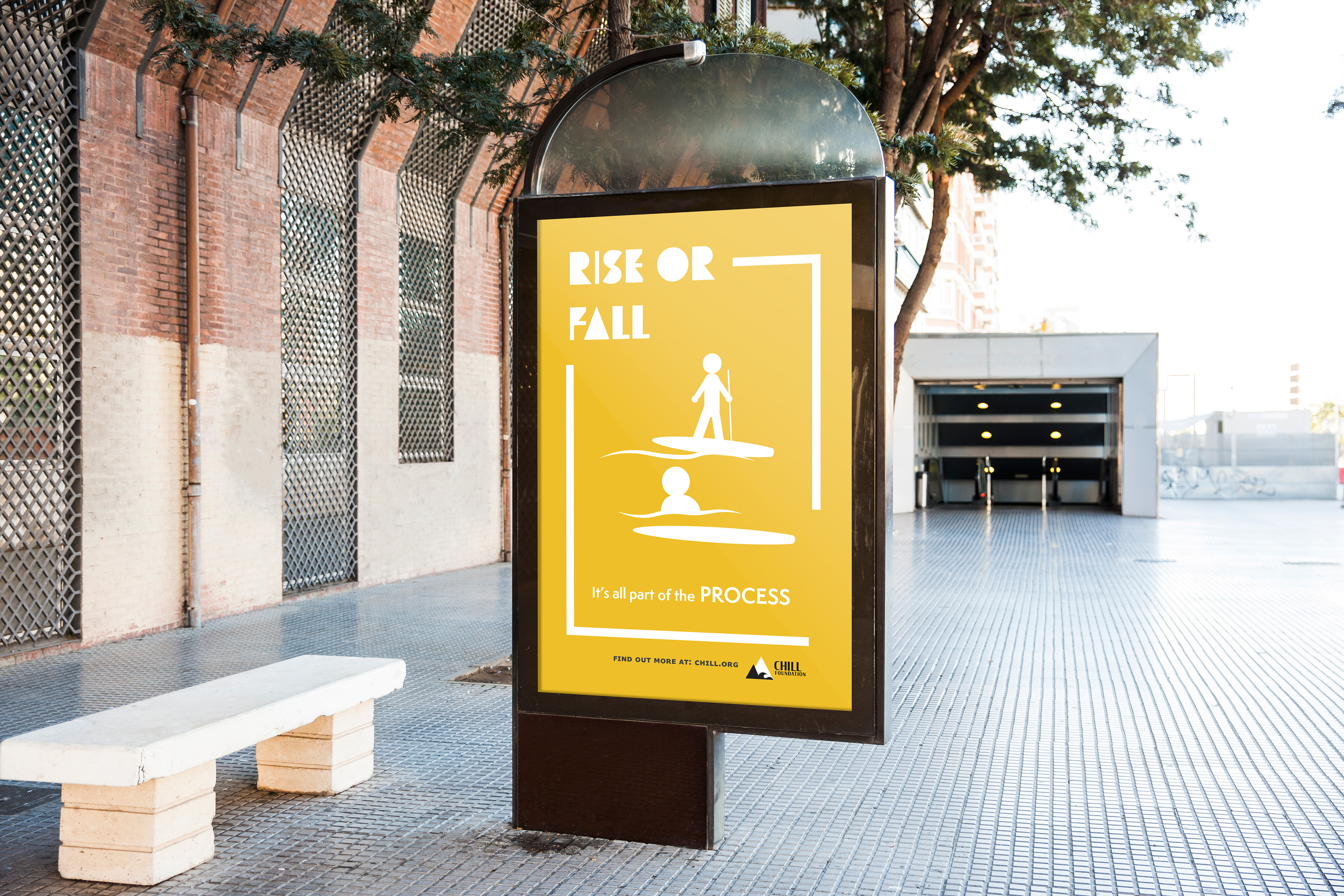
Ads to bring awareness to Chill's Cause
My colour choices and ad styling reflects the intention of my ad campaign as well as the target audience. As Chill offers youth development programs, their primary target are the youth themselves. I chose a brilliant colour palette to draw their eyes. To make the ads even more eye catching to the demographic, I used simple, "trendy" graphics to make the ads really pop. My typography choice is playful and bold, tying into the mood of Chill Foundation and what it stands for.
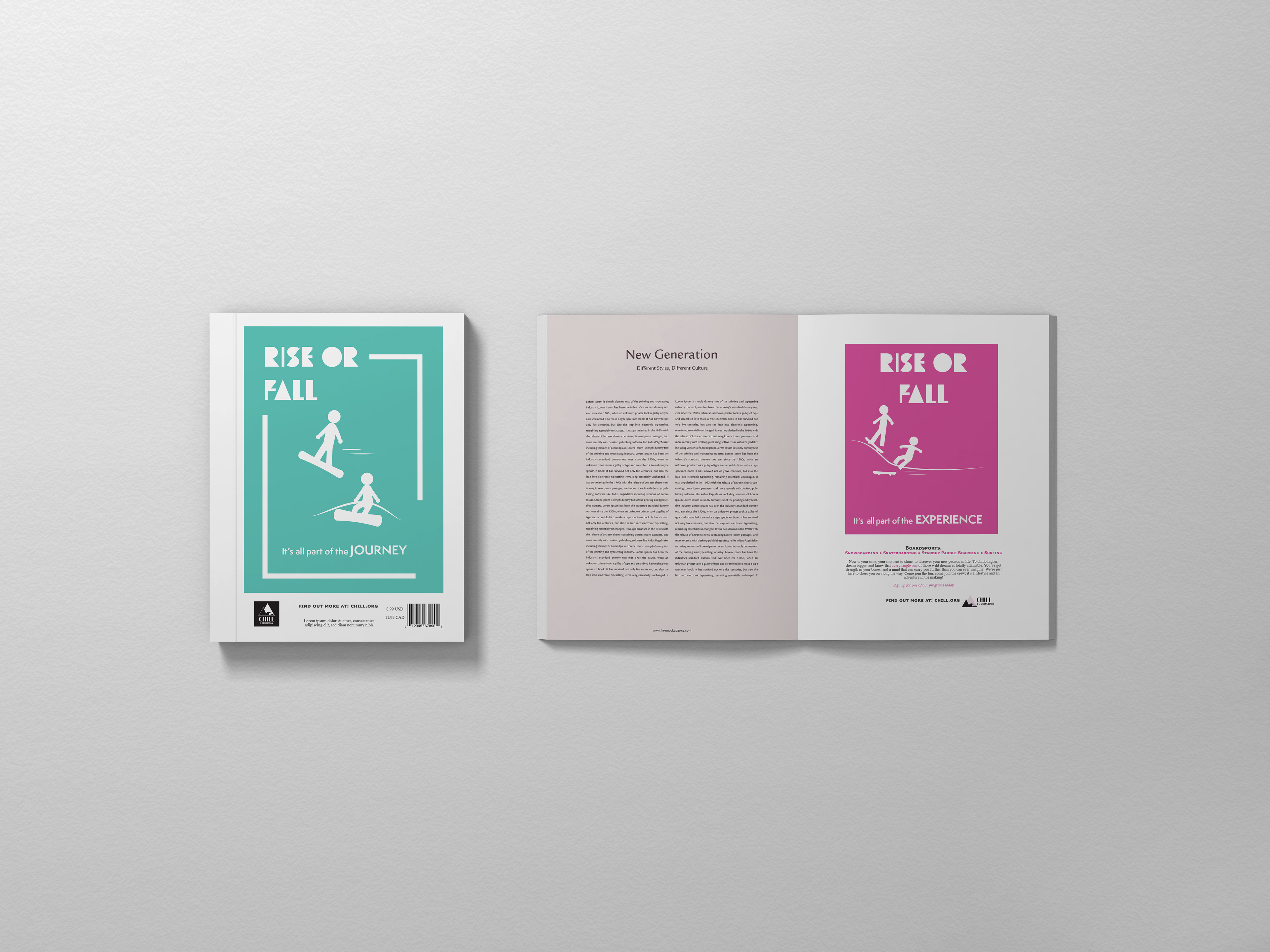
Magazine cover and inner advertisement. Additional Text and information included about the organization
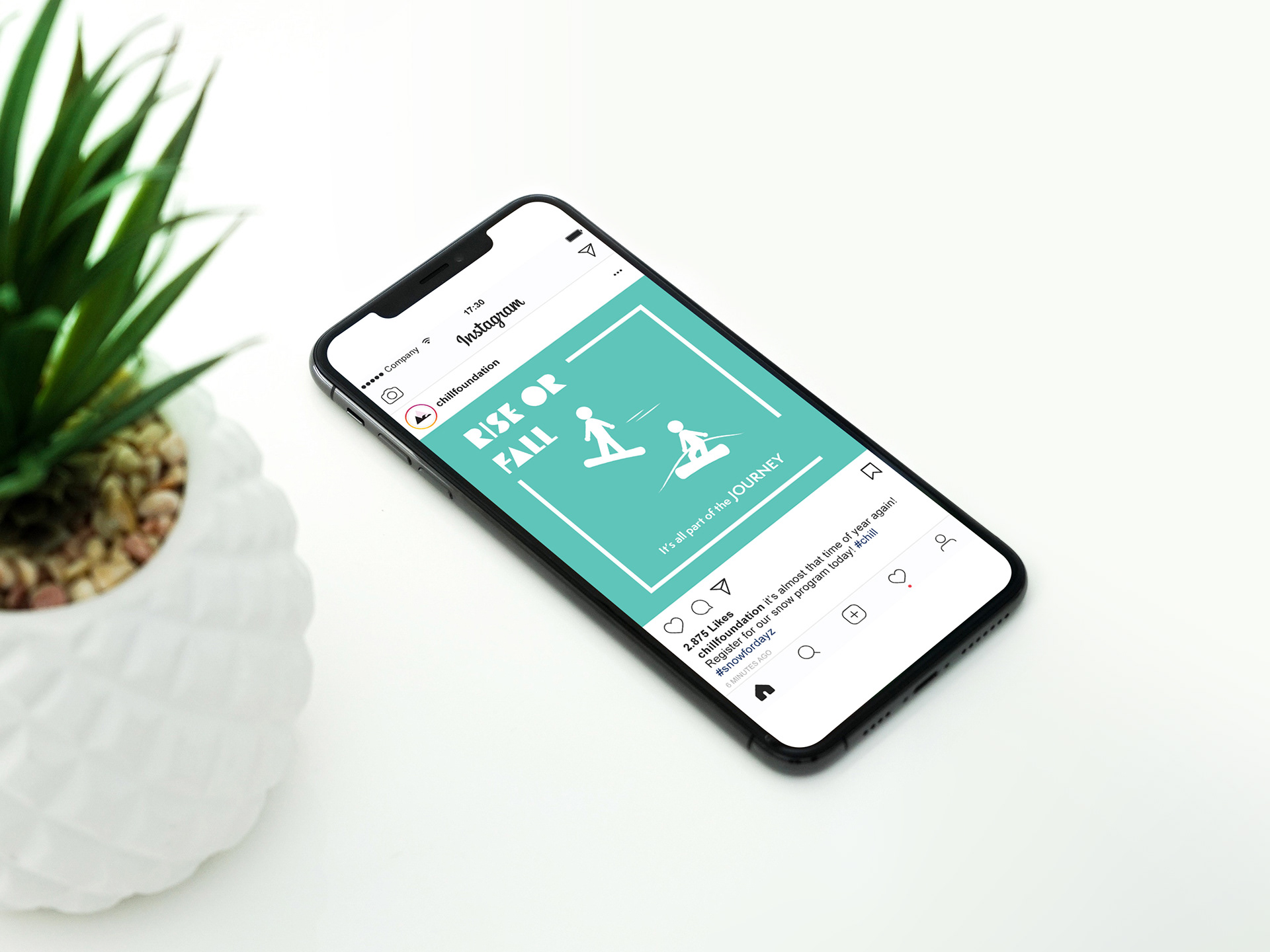
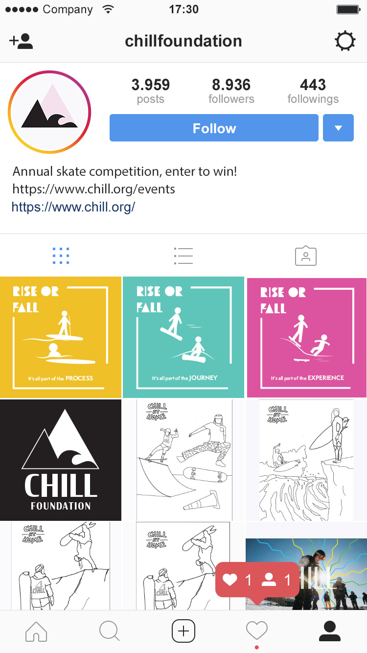
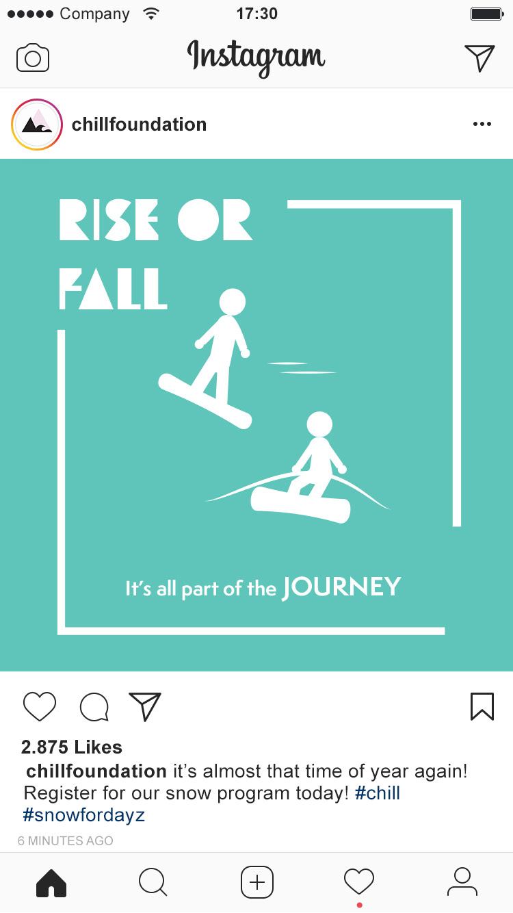
Instagram advertisement / layout
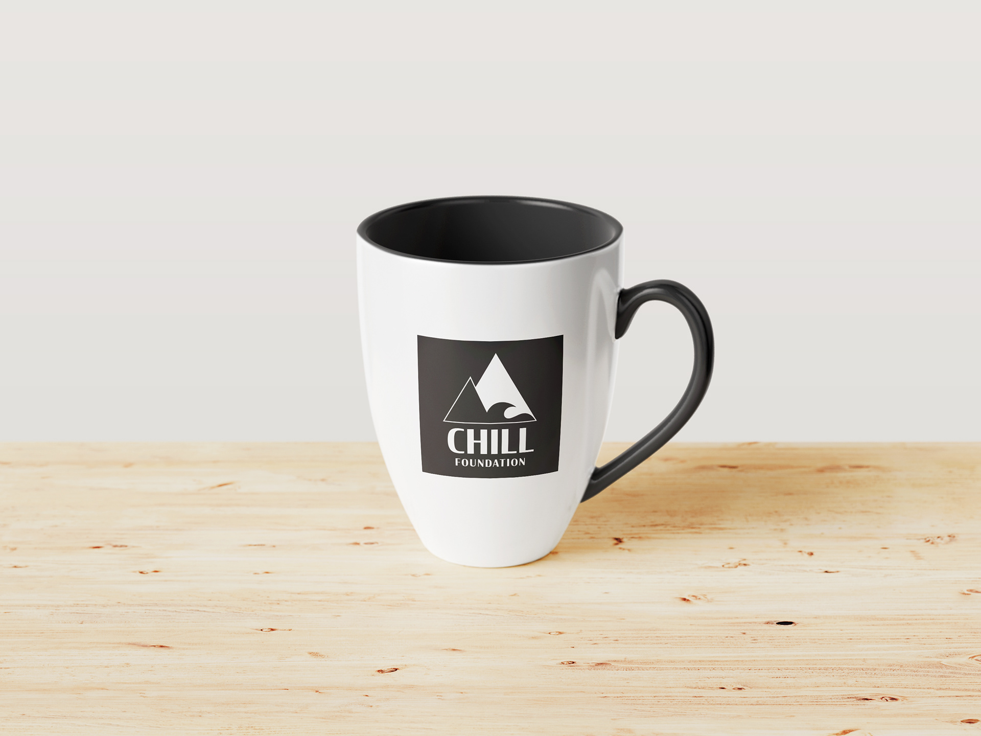
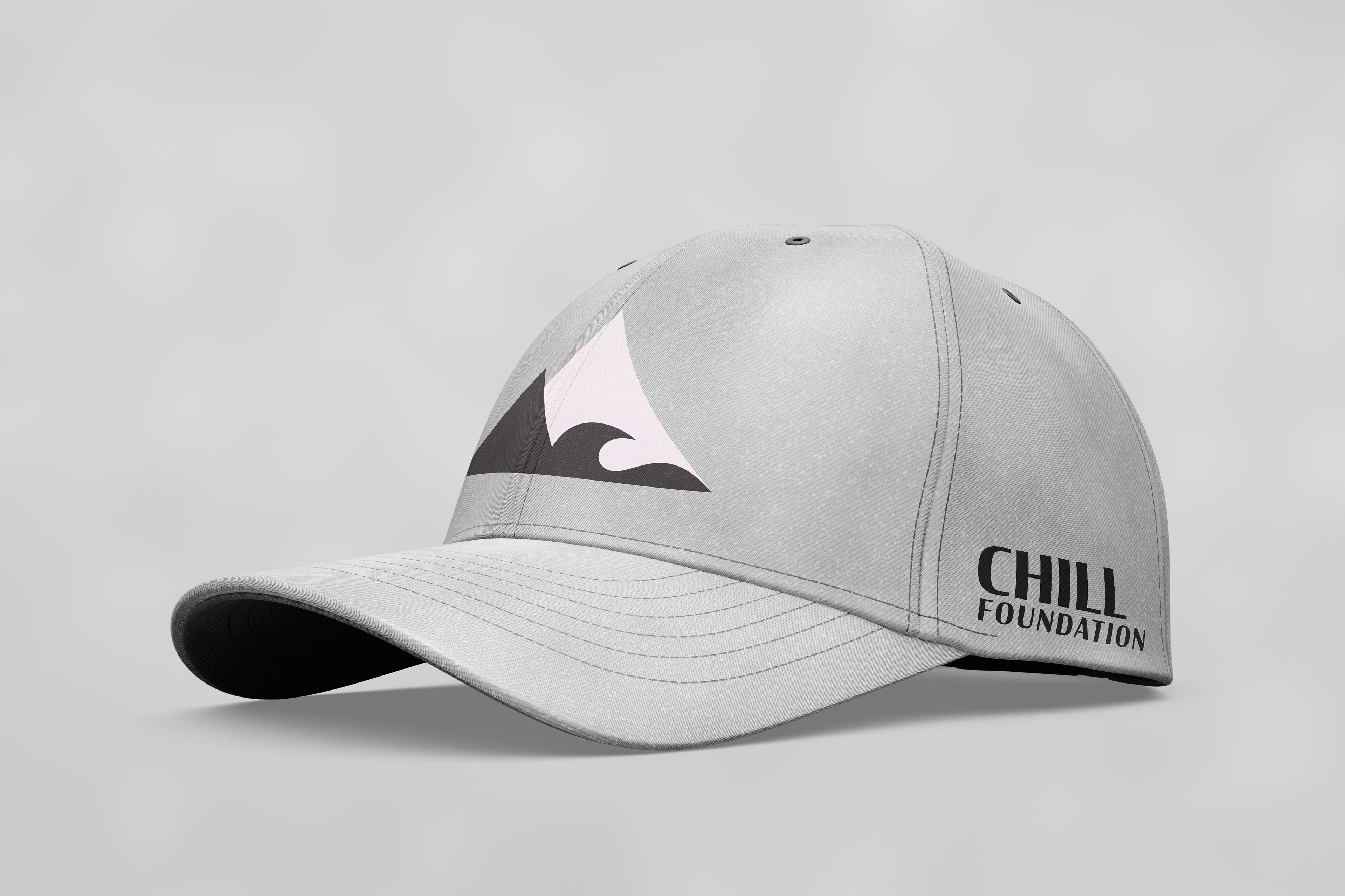
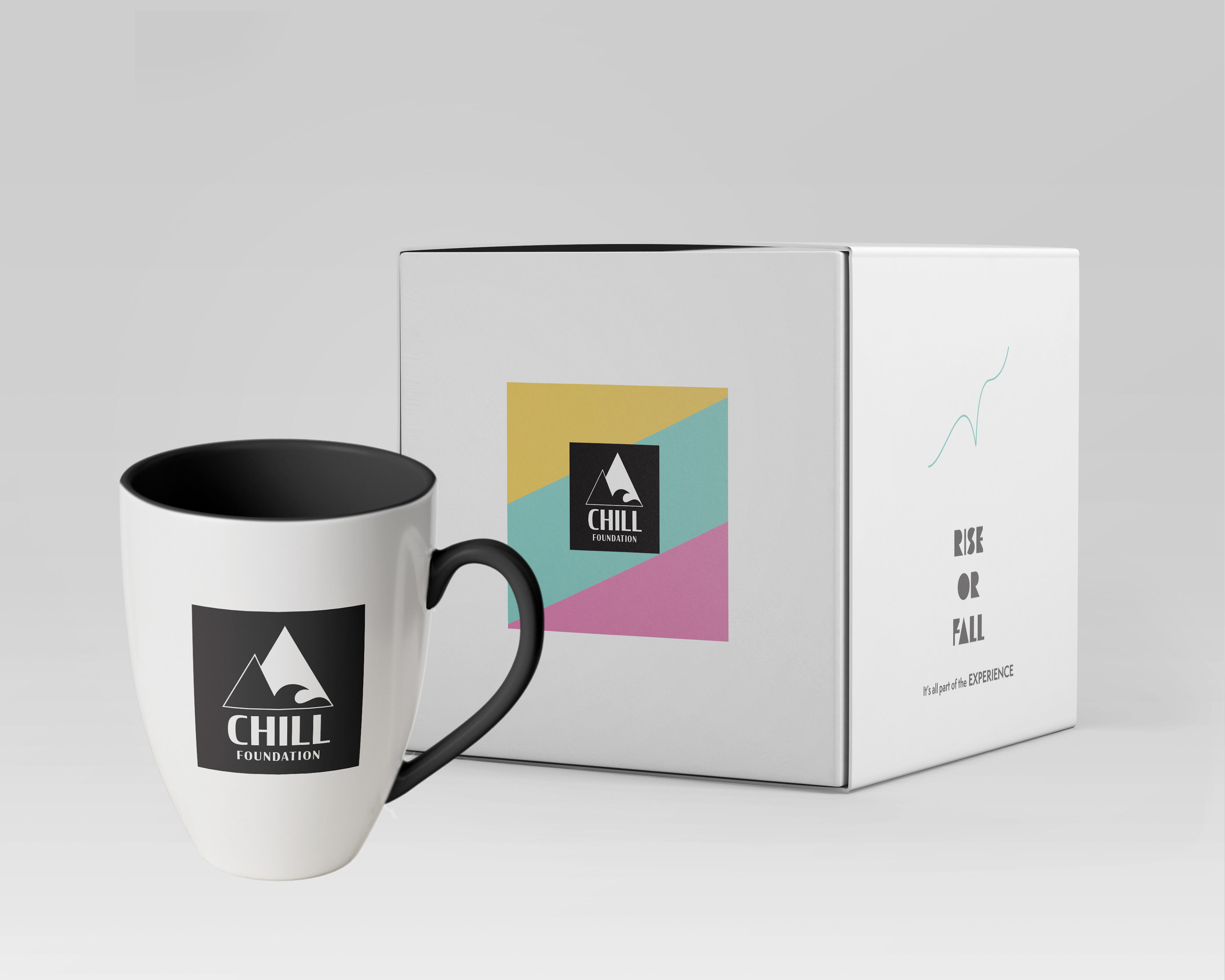
Various merchandise supporters and/or participants may purchase to support the Chill's cause and the programs they offer. All custom designs and layout were created by myself.
Software Used:
Adobe Illustrator | Adobe Photoshop